
ROLF BREMER
If there were a sound playing in the background while someone experiences your work, what would it be or what kind of atmosphere would it create? Think of music, ambient noise, or even silence, what feels right for your art?
“Really quite varied. Just as diverse as my works are, the musical accompaniment would be just as varied. It could be straightforward techno, atmospheric sounds, white noise – and so on. When I think about it, the current album by Perfume Genius could be the soundtrack to my new series of paintings. Funnily enough, the title “Am Herz vorbei” is borrowed from a song by Tristan Brusch. While that song might not be the perfect background music for the painting itself, the title fits perfectly..”
Do you aim to evoke specific emotions in your viewers? If so, which feelings do you hope to bring out through your art?
“Yes, but nothing concrete. There are always moods and ideas that lead me to a piece of work, but they’re often not easy to transfer to someone else in a predictable or calculated way. I'm always amazed at the wide range of feelings and interpretations people have about my work – and I think that’s a really good thing.”
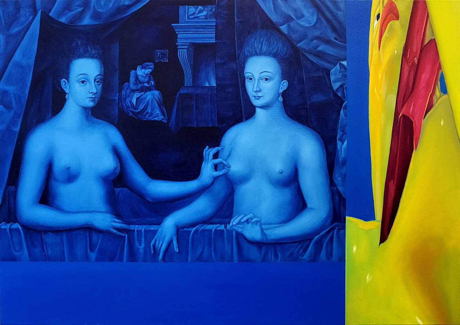
Could you share more about the meaning behind your painting am herz vorbei ii? What inspired it, and what should the viewer take away from it?
“The series “Am Herz vorbei” consists of three paintings. It was inspired by the Renaissance painting “Portrait of Gabrielle d’Estrées and the Duchesse de Villars.” I’ve always found that painting fascinating because it’s so peculiar – the gesture, the hand position, the mannered bodies. The second part of my series references the original image. Opposite that is a depiction of a 3D modulation. The work on the 3D models, which deals with the penetration and merging of bodies, is actually the foundation of the series.”
What motivates your use of a vibrant color palette in your paintings? Is it emotional, symbolic, intuitive or something else?
“I simply wanted bold, statement colors that contrast well with each other. That’s why I chose the primary colors blue, red, and yellow. The blue also plays with the iconography of ultramarine – a color whose effect is hard to resist.”